
Optimizing G2 Product Pages for Conversion
Shipped a high-impact PDP redesign in 6 weeks, boosting buyer conversion by 20%.
The Challenge
The PDP is one of G2’s most visited pages and one of the most important in a buyer’s journey. But it was cluttered, inconsistent, and difficult to navigate, especially on mobile. We set out to rebuild it to improve clarity, trust, and ultimately, conversion. What we were up against:
Critical content was buried or hard to scan\
CTAs lacked clarity and consistency
The page had 142 accessibility violations
Mobile usability was poor
Conversion was flat
We needed a more intuitive, accessible, and trustworthy experience that made it easier for buyers to evaluate products and take action.
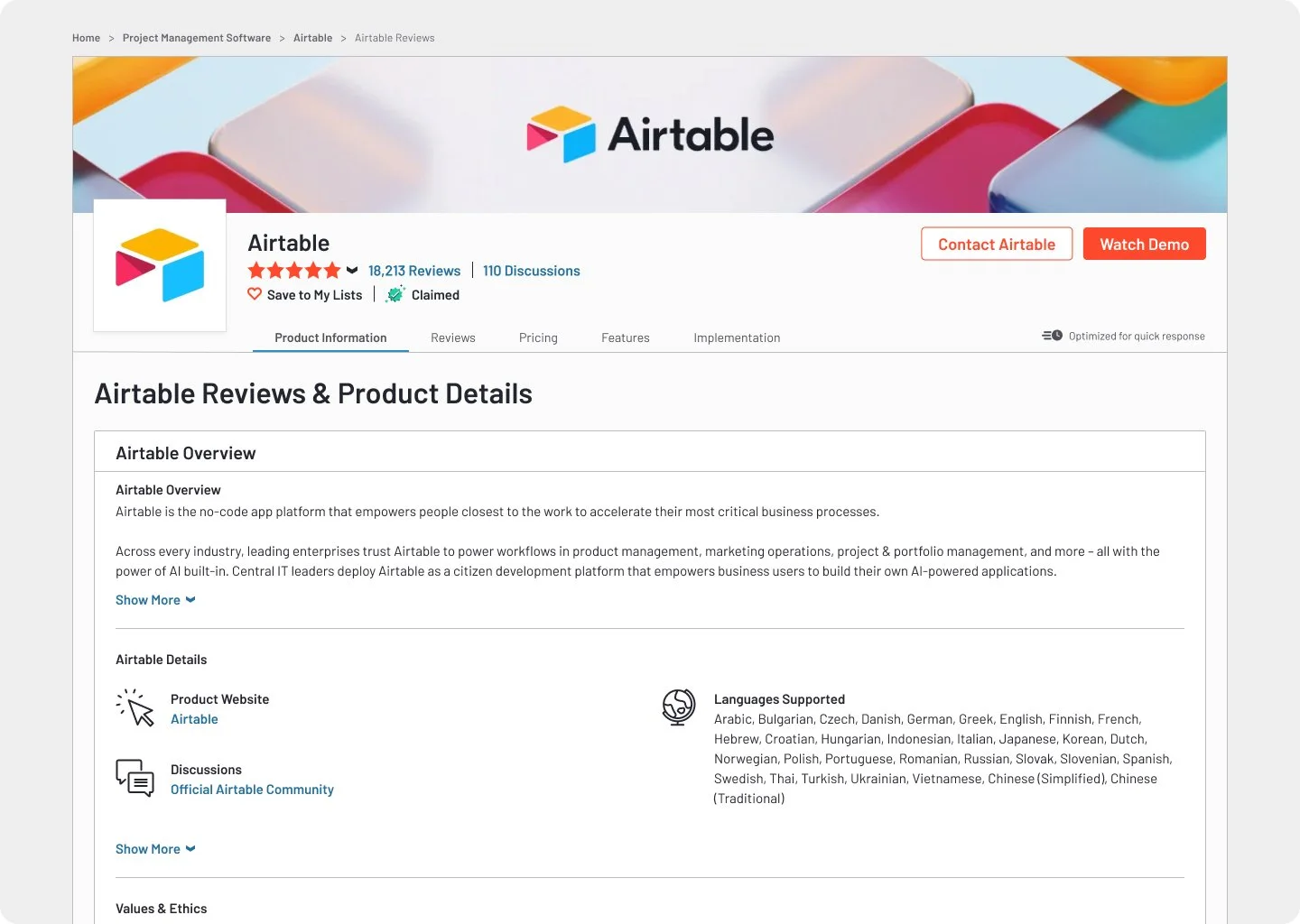
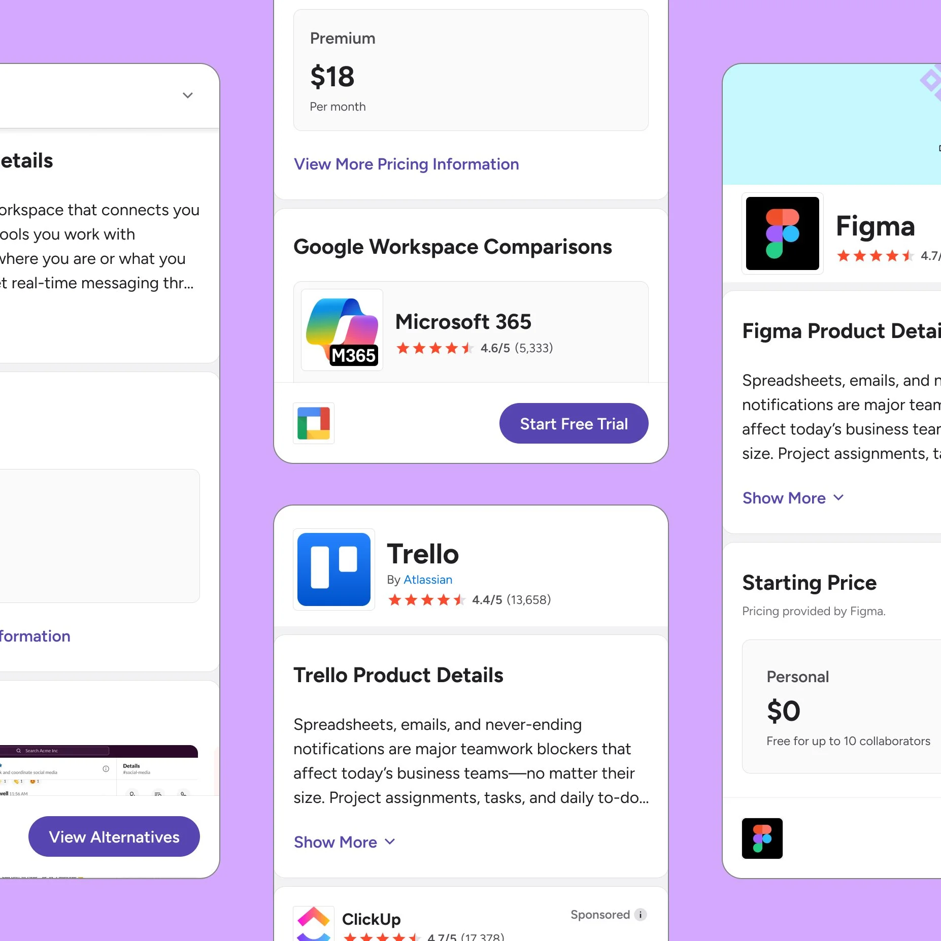
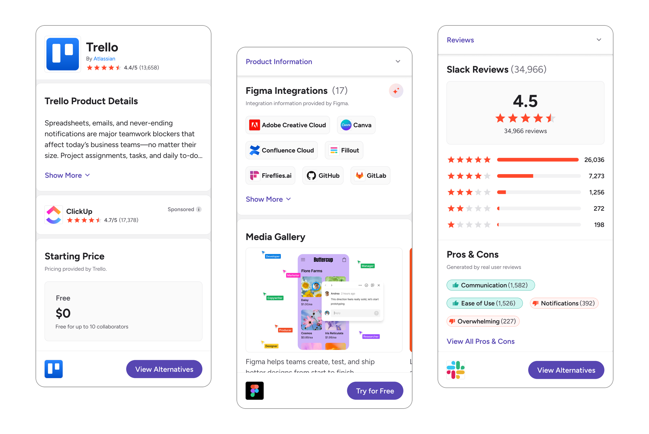
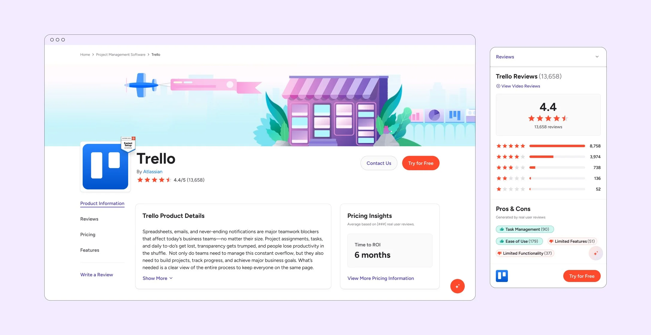
The header lacks visual hierarchy and overloads users with competing elements like CTAs, ratings, and pricing. The wide center column makes content harder to scan and read.
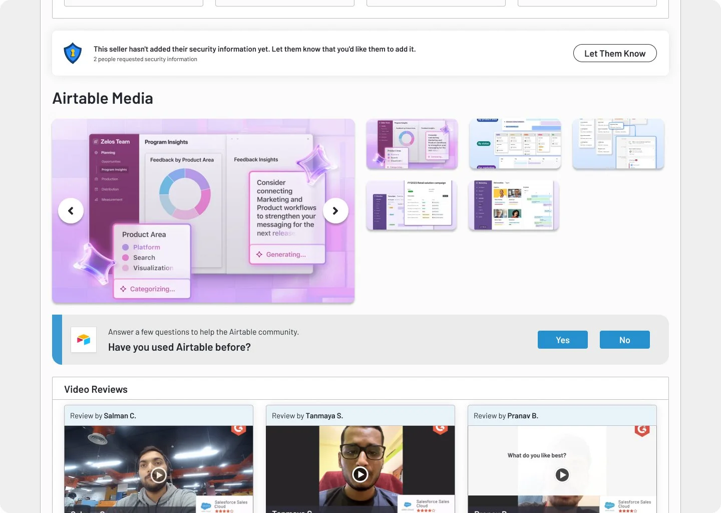
The image carousel is dense and difficult to navigate. Alt text only appears on hover, causing layout shifts, and keyboard navigation is not supported in full-screen mode.
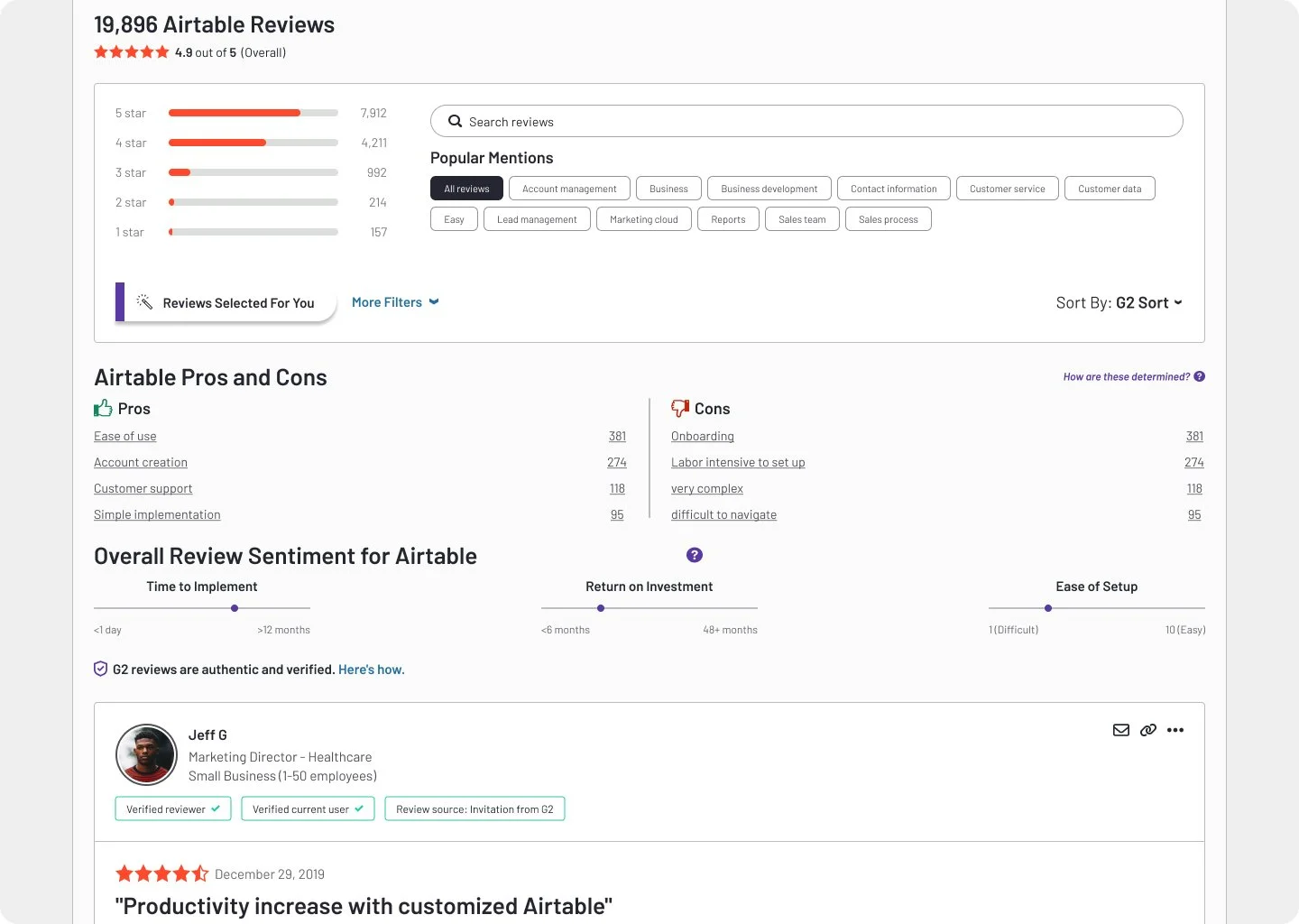
On the reviews section, the filters are robust but dominate the layout, feel disconnected from the reviews, and are underutilized. On mobile, the section is especially dense and hard to navigate.
Approach
We started by auditing the existing experience alongside stakeholders from accessibility, engineering, and data. Key pain points emerged:
Layout was overwhelming and repetitive
Buyers didn’t understand what to do next
Vendors often requested UI changes to highlight specific features or CTAs
I explored 15+ layout variations across desktop and mobile, eventually narrowing down to a responsive structure that simplified navigation, prioritized buyer needs, and ensured consistency across G2.com.

Key Improvements
Sticky CTAs: Made the primary Compare button sticky on mobile to reduce friction. We prioritized mobile in both structure and behavior, simplifying the layout for faster scanning on small screens.
Clearer content hierarchy: Surfaced key product value props and social proof earlier in the scroll
Modular sections: Created a more flexible, responsive structure that could scale with new AI-powered content
Accessibility fixes: Reduced WCAG violations by more than half through color, contrast, and structure updates
System consistency: Integrated the redesigned PDP into the Buyer branch of our Elevate design system
The Results
+20% increase in buyer conversion
Cut QA cycles by unifying variants into reusable, testable modules
Bounce rate dropped significantly on mobile
Reduced internal design debt and improved handoff quality
Laid the groundwork for future AI integrations and personalized entry points
What I’d Do Differently 💡
Design for vendor edge cases upfront. Certain pricing modules needed more flexibility than expected. Planning for a broader range of vendor use cases earlier would have reduced engineering rework.
Maintain a stakeholder feedback loop post-launch. While seller comms were strong pre-launch, building a formal post-launch feedback loop with the Customer Success team could have helped us more quickly surface edge-case friction and make adjustments faster.