
TM BBQ Finder App
Helping Texans find the best BBQ with a modern, user-friendly mobile experience.
The Challenge
Texas Monthly is the definitive authority on BBQ in Texas, but its original BBQ Finder app didn’t live up to that reputation. The app felt outdated, buggy, and more like a static directory than a dynamic discovery tool. It failed to showcase the magazine’s rich content and lacked the intuitive experience users expect from modern mobile apps.
The Goals
Redesign the BBQ Finder app using insights from user research
Elevate the user experience to match Texas Monthly’s brand authority
Feature exclusive content, including the 2021 Top 50 BBQ list
Build a reliable and engaging tool for BBQ lovers across the state
Understanding the Users
I interviewed internal stakeholders to define three core user types:
TM BBQ Club Members (logged in)
Logged-in users without a membership
Guest users (not logged in)
I mapped user flows for each persona to ensure key features—like map-based discovery, list sorting, and saved joints—were accessible and intuitive across login states.


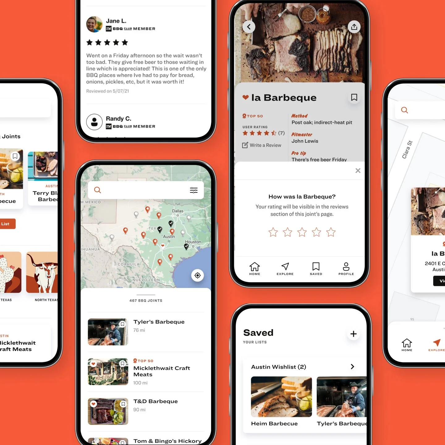
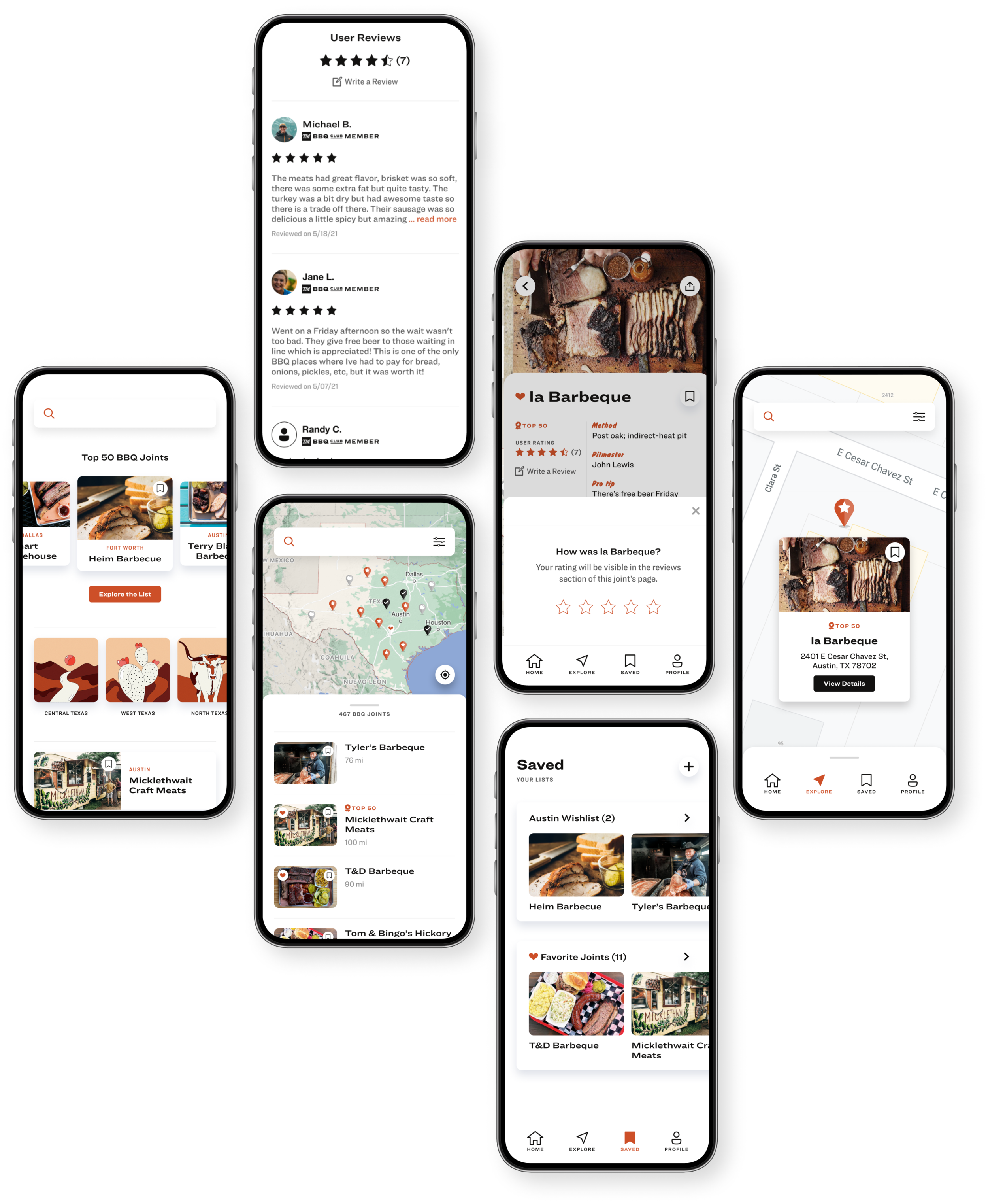
Wireframes & Prototyping
I analyzed common UI patterns in food, travel, and review-based apps (like Yelp, Google Maps, and AllTrails) to inform a modern, mobile-first design system. Using Figma, I created low- and mid-fidelity wireframes, then translated them into an interactive prototype for testing.
Usability Testing
We conducted moderated usability testing with 5 highly engaged Texas Monthly BBQ readers. All participants regularly seek out new BBQ spots and use mobile apps to guide their experiences.
Research goals:
Identify usability blockers
Assess ease of navigation and task completion
Uncover gaps between expectations and actual experience
Tools used: Zoom, Figma, Ethnio
Key Takeaways:
Users expected a more dynamic, location-based experience
Sorting and filtering were top priorities for planning BBQ road trips
Content from the magazine added trust and depth—especially Top 50 picks
Map interactions needed to feel snappy and familiar


Look & Feel
To create a sense of brand familiarity, I incorporated key elements from the Texas Monthly website (type, color palette, and editorial tone) while tailoring the interface for a native app experience.
The result: a modern UI that felt recognizably “Texas Monthly,” but optimized for exploration on the go.
Results
After launch, the redesigned app delivered strong results:
User growth: from 300 → 10,700 users
Session time: 3 minutes → 12 minutes average engagement
App Store rating: 5 stars on Google Play (600+ reviews)
The app now serves as a trusted companion for BBQ fans across Texas—whether planning a road trip or just finding the best brisket nearby.
You can download the app on Google Play and the App Store.
What I’d do Differently 💡
Set Success Metrics Early
Defining clearer success metrics for engagement at the start would have helped us measure long-term feature impact, not just adoption.
Test High-Fidelity Prototypes Sooner
Our mid-fidelity testing was valuable, but more rounds with near-final designs could have helped fine-tune critical interactions (especially on the map and filtering features.)